
Article Summary
- Clear data visualization helps readers interpret and understand data
- Ideally, charts should be anchored at 0 on the Y axis
- Pay attention to potentially misleading data on charts with two axes
- The use of colors and layouts can help you better inform and influence an audience
Jeffrey D. Camm is the Inmar Presidential Chair in Analytics and Senior Associate Dean of Business Analytics Programs at Wake Forest University School of Business. This article is based on his presentation at the 2021 Decision Sciences Institute conference Cengage session.
We live in a data-driven economy, and therefore understanding data visualization is essential to understanding modern economics. According to Statista.com, the amount of data created and consumed worldwide is expected to grow from 79 zettabytes in 2021 to 181 zettabytes in 2025. The internet of things, cell phones, social networks and sensors, all generate vast amounts of data. This data is then used in a variety of ways to market products and services and inform and/or sway public opinion.
As a society, we now expect to be informed by data before we make decisions, from what investments to make to which college we should attend. As with many other phenomena, such as how we work or shop, the COVID-19 pandemic has accelerated this dependence on data. Charts, graphs and maps of COVID infection rates are ubiquitous. Publications such as USA Today, The Wall Street Journal and The Economist rely heavily on understanding data visualization. What are the implications of this for the skills needed to thrive in an increasingly data-driven society?
Understanding Data Visualization as a Consumer of Information
As a consumer of information, it is important for you to understand data visualization best practices to be aware of common misleading mistakes and tricks. The single best piece of advice is to pay attention to the axes of a chart.
For example, while there are times when it is OK to start an axis at something other than zero (i.e. when showing the change in a series of data over time), there are certainly times when not starting at zero can be misleading, or can be used to make changes seem more pronounced. Consider Figure 1 below. Which chart, (a) or (b), elicits a stronger response from you to the drop in sales in 2020? Most people would say chart (a). But, chart (b) provides a more accurate view of what is happening. Always check the axes to anchor what you are seeing. Chart authors should anchor bar and column charts at zero to present the data in the most transparent way.
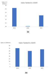
Figure 1. Comparing two Column Charts. Source: Jeffrey D. Camm
Similarly, you need to be careful with charts that have multiple axes. Consider Figure 2, a chart created by the Kansas Department of Health and Environment. The graph shows daily COVID-19 cases per 100,000 people in counties with a mask mandate (orange) with those without a mask mandate (blue).
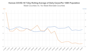
Figure 2. COVID chart with two axes from the Kansas Department of Health and Environment. Source: Engledowl and Weiland
At first glance, how do you interpret this graph? The positivity rate drops when a place implements mask mandates versus when there is no mask mandate. That’s good. It also appears that counties with mask mandates have reached an overall lower level of COVID than those without a mask mandate. But that is not the case.
Notice there are two axes – orange “Mask” on the left and blue “No Mask “on the right. Here’s a question you should ask: “Why are they using two axes?” This is usually warranted when the two graphs you are plotting are on very different scales (example, millions of dollars and percentages). Here, the scale of the two axes is not that different.
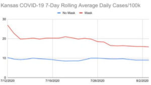
Figure 3. COVID data from the Kansas Department of Health and Environment plotted on one axis. Source: Steven Strogatz on Twitter
Figure 3 shows the two graphs on the same axis. While mask mandates do appear to drop the positivity rate, the overall positivity rate for counties without a mask rate are lower. So, if your goal is to live in the safer county, you would move to a county with no mask mandate. How can that be? Counties with low positivity rates, perhaps rural counties versus more heavily populated counties, maybe have less of a need for mask mandates than those with higher positivity rates.
The second chart is a better reflection of what was happening, but perhaps did not reinforce the intended message of the creator as effectively. Always be sure to check the scales and assignments of multiple axes before jumping to conclusions.
Understanding Data Visualization and the Influencer
When creating a chart, you should have two things: an intended audience and a message tailored to that audience that informs, elicits a reaction and influences them. There are basic best practices in data visualization that are generally accepted, such as simpler design, using color with purpose and not using higher dimensions than what is required to show the data. These best practices help you inform and influence clearly and honestly.
Consider this example from Camm, Fry and Shaffer. We have data on the majors of students in a college of business, and the percentage of students in the college in each major. We can then use this data to recruit students, so we can think of the audience as prospective students and their parents. Figure 4 is a three-dimensional pie chart of this data.

Figure 4. A three-dimensional pie chart of Business college majors. Source: Camm, Fry and Shaffer
There is no value from the third dimension. In fact, it makes the chart more difficult to read. So, let’s get rid of the third dimension as shown in Figure 5.

Figure 5. A two-dimensional pie chart of Business college majors. Source: Camm, Fry and Shaffer
This is an improvement, but many of the colors are too similar. Readers also have go back and forth between the key and chart, making it difficult to read.
Humans are able to distinguish differences in length more easily than angle or area. Therefore, many data visualization experts recommend using a bar or column chart rather than a pie chart. Figure 6 shows a bar chart of our Business college majors. The chart is sorted from high to low percentages, making it easier to answer questions like “How popular is the Information Systems major?” Notice that with the bar chart, we no longer need color or the distraction of a key. Compare the simplicity and usefulness of Figure 6 to Figure 4.
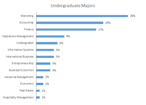
Figure 6. A bar chart of Business college majors. Source: Camm, Fry and Shaffer
Finally, suppose we are talking to students who are interested in the Operations Management major. In Figure 7, we use color to draw attention to Operations Management and reinforce our message. Additionally, rather than using a generic title, we make the title of the chart our message.
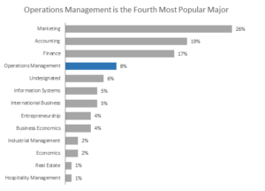
Figure 7. A bar chart of Business college majors using color purposefully. Source: Camm, Fry and Shaffer
Summary
In an increasingly data-driven economy, critically thinking and understanding data visualization will help you become an intelligent consumer of everything from news to claims in advertising. As an influencer, adhering to data visualization best practices helps ensure that the charts you create are clear, easy to digest and on target with your audience.
To learn more about data-driven visualization, explore Jeff Camm’s eBook, Data Visualization: Exploring and Explaining with Data, in the Cengage Instructor Center.